
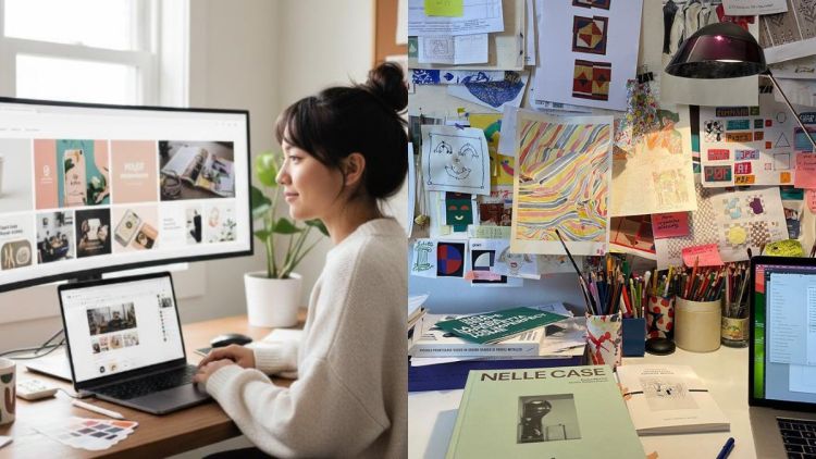
The issue usually isn’t creativity. It’s consistency. Taking one strong idea and turning it into dozens of variations without losing what made it yours is hard.
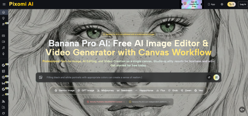
The usual advice is to open an image editor and color-correct everything until it matches. That works as a patch, but it treats the symptom. A better approach is to lock your visual rules in before you create anything. Node-based canvases like Nano Banana Pro are built for exactly this kind of work, because they let you map out how your reference images connect to your final outputs, so every new piece stays on brand.
Step 1 of 4
Set your aesthetic rules before you create anything
Before you open any design tool, decide what your brand will always look like and what it will never look like. These rules filter every creative decision you make later.
Most scattered portfolios happen because the creator started making things without deciding on boundaries first. The result is mismatched colors and lighting that contradict each other from piece to piece.
Write a visual anatomy checklist. Keep it short and specific. Here’s what one might look like:
Once it’s written down, you stop judging work by “do I like this?” and start judging it by “does this match my rules?” Choosing which pieces go public gets much easier.
Quick audit: your last 10 pieces
Grab your 10 most recent graphics and put them side by side on one artboard. Here’s what color drift usually looks like:
Color drift, piece 1 to piece 10
Each step looks tiny, so you don’t notice it happening. Side by side, it’s obvious. Style creep works the same way: clean backgrounds early on, heavy textures later.
Spot the differences now, reset your baseline, and then start making new work.
Step 2 of 4
Build consistency into every new piece
Rules on paper only help if your process follows them. This matters most when you have a recurring character or subject, where the face, proportions, and setting need to stay the same every time.
Step 3 of 4
Use a node workflow for tricky edits
Here’s where consistency gets hard. A client loves your character but wants a different background. With most linear generation tools, changing one detail means regenerating the whole image, and the character often comes out slightly different. Do that a few times and your style starts to drift. It also eats hours.
The fix is to separate the parts of an image so you can change one without touching the others. That’s what a node-based, infinite canvas like Nano Banana Pro makes possible. Instead of one prompt producing one image, you connect building blocks:
+
+
→
The parts that make your character recognizable stay fixed. Only the scene changes.
Real-world example: a client approves your character but wants the scene moved from a daytime city street to a nighttime interior.
Step 4 of 4
Test your graphics where clients will actually see them
A set of images can look consistent on its own and still fall apart in real use. Clients rarely see your work in isolation. They see it inside websites, newsletters, and pitch decks, often small, compressed, or cropped. A common mistake is designing only for full-screen viewing.
Consistency is what turns a portfolio into a brand
Standing out as a freelancer isn’t about making one amazing piece. It’s about making a body of work that clearly comes from one person. Instead of treating each portfolio update as a separate project, build a production system around fixed reference points: clear rules, a consistent workflow, and real-world testing.
The payoff grows over time. A reliable workflow means fewer bottlenecks, less redesigning from scratch, and less stress as your client list grows. Check your published portfolio against your baseline rules every so often, so your style stays tight even as your skills improve.
And when a potential client scrolls through a portfolio where everything clearly belongs together, they see someone dependable, someone they can trust with a bigger campaign.